The Story Behind Japan's 〒 Postal Logo:
If you live in Japan, surely you've seen it before. It's a symbol that looks like the capital letter T but with an additional horizontal line above it: 〒. Known as the postal mark (yubin kigo), it's a symbol that represents the Japanese postal system. Despite a decline in physical letters sent, the postal system is still very much a part of life in Japan as it also offers banking and other financial services (an odd notion in itself as most Americans would never consider banking with USPS) and the 〒 appears on post boxes, delivery trucks and branch offices.
the 〒 mark on a postal delivery truck
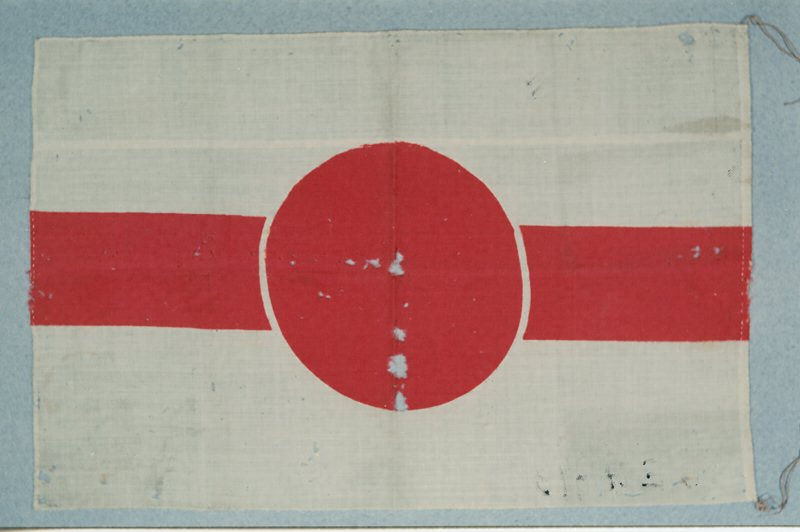
The story of how the 〒 came to be dates back to 1871 when the Japan Post began operating as an organization. From the onset, a logo didn't exist and, instead, they were simply represented by the characters 郵便 (yubin, or post). But around 1877, a red circle with a bold line though it began being used. It was adopted as the official postal mark in 1884 by administrative order from the Grand Council of state.
the original postal mark (1877 - 1887)
In 1885, the now-defunct Ministry of Communications and Transportation (teishinshou 逓信省) is formed, and they take over all postal matters. It's first minister was Enomoto Takeaki, a samurai and admiral who had fought against the new Meiji government, lost and imprisoned, but later pardoned.
But just 3 years after the first mark was made official, a new symbol was announced. On February 8, 1887, it was announced that T would be the new logo. Then, days later on February 14th a new announcement was made that 〒 was the official symbol. Several days after that an explanation was given, citing that T was published by mistake and it should have been 〒.
It's unclear what led to this series of mishaps but to summarize the various theories, the original T was likely taken from the first letter of the ministry's name: Teishinshou. However, this was problematic for several reasons. It was too simple and, more importantly, the letter T was already a universally accepted postal code for insufficient postage. So the T needed to be changed. One theory that explains how T became 〒 is that the logo for shipping company NYK (Nippon Yusen Kaisha), founded in 1885, was 2 bold red lines. According to researchers of this Japanese trivia show, the symbol was interpreted as a pun: ni-hon means 2 lines, but can also mean Nihon, as in the country (NYK claims that the lines represent ambitions to traverse the planet, rather than a pun). And so the concept was co-opted by the ministry to create 〒, which stuck and has now been used for over 130 years.
the 〒 mark for the Japanese postal system
(Via Spoon & Tamago) (all photos via wikimedia commons)
Also on:Filed under: Japan,


